
You open your cloud console because the monthly number moved. Within a minute you know it was EC2. Twenty minutes later you still cannot say which account, which usage type, or which instance — not because the data is missing, but because answering that question means rebuilding the same report three times.
That distance, between seeing a cost and investigating one, is where the native tools differ most from each other. All three major clouds hold the underlying data, and all three will show you a resource-level number if you ask correctly. What differs is the reporting workflow: how many dimensions you can hold on screen at once, how far back the finest grain reaches, and how much configuration sits between a total and an answer.
This post walks the same investigation through AWS Cost Explorer, Microsoft Cost Management and Google Cloud Billing, then through a dedicated report builder. It is about reporting workflows, not a ranking — the right one depends on how many providers you run and how often you have to ask.
AWS Cost Explorer: group, filter, then group again
Cost Explorer opens on month-to-date spend, a forecast, and your top cost trends. Choosing a trend takes you into a report you can group and filter. The console is free to use; the API that backs it is billed per request.
The shape of the workflow comes from one documented constraint: a Cost Explorer query groups by at most two dimensions at a time. In the API reference it reads “You can group AWS costs using up to two different groups, either dimensions, tag keys, cost categories, or any two group by types.” Account and service, or service and usage type — but not account, then usage type, then resource, in a single table.
So AWS documents the investigation as a sequence rather than one view. Group by service to find which service moved. Filter to that service. Group by resource to find the instance inside it. Each step is a report you reconfigure, and the trail back to where you started is the browser history.
Resource-level rows are available, with setup. The management account enables them per service, and once enabled they cover the past 14 days at daily granularity — not your full history. That is the number to carry into planning: an investigation opened three weeks after a spike is already outside the window. Spend on services you have not enabled appears under “No resource ID”, and for resource detail older than 14 days AWS points you at the Cost and Usage Report — a different tool with a different query model.
Microsoft Cost Management: nested views, then Power BI
Azure splits cost analysis in two. Smart views are curated and structurally nested: open a subscription, expand it to its resource groups, expand one of those to its resources, and expand a resource to the product meters underneath it. You follow a cost down the hierarchy without rebuilding anything, and you can open several views in tabs side by side.
Customizable views are the editable counterpart — a date range, a granularity, a group-by and filters you can save, share, pin to a dashboard or subscribe to as a scheduled email. They answer a narrower kind of question, and Microsoft is direct about where they stop: “If you require more advanced reporting, like grouping by multiple attributes or fully customizable reports, use Power BI or export raw cost details.”
That is a clear division of labour rather than a gap. Interactive exploration happens in cost analysis; multi-attribute reporting happens in Power BI or over exported data. It does mean the answer to a three-dimensional question lives outside the console, in a tool your finance team may own and your engineers may not.
Google Cloud Billing: a table that is already a hierarchy
Google approaches it from the opposite end. Alongside the Reports view, the cost table arrives pre-nested — project, then service, then SKU, then consumption model — with rows you expand and collapse in place. You can regroup it, including a custom grouping of up to three dimensions, and download the result as CSV.
The constraint here is time rather than depth. The cost table is organised by invoice month, not by an arbitrary date range, so “the last 45 days” is not a question it answers directly. Custom windows and per-resource analysis run through the BigQuery billing export, which is capable but moves the work into SQL and onto a different surface.
The three side by side
| AWS Cost Explorer | Microsoft Cost Management | Google Cloud Billing | |
|---|---|---|---|
| Grouping dimensions per query | Up to 2 | 1 (smart views nest structurally) | Up to 3 in the cost table |
| Nested, expandable rows | No — successive reports | Yes, in smart views | Yes, by default |
| Resource-level rows | Opt-in per service, past 14 days | Yes, in smart views | Via BigQuery billing export |
| Time model | Date ranges; daily or monthly, hourly opt-in | Date ranges; daily capped at 3 months | Invoice month |
| History | 13 months (38 with opt-in) | Varies by agreement | Back to May 2019 |
| Result ceiling | Top 5,000 resources per service | CSV or Excel download | CSV: 4M rows, 150 MB |
| Multi-attribute reporting | Cost and Usage Report | Power BI or exports | BigQuery export |
| Other providers | No | AWS connector retired 2025 | No |
| Cost to use | Console free; API $0.01/request | Included | Included |
What changes when you run more than one
Each tool is coherent on its own provider. Run two and the friction is vocabulary. AWS has linked accounts, Azure has subscriptions, Google has projects. AWS has usage types, Azure has meters, Google has SKUs. None of them is wrong, and none of them reconciles with the others, so a question like “what did the platform team spend last month” becomes three investigations and a spreadsheet to add them up.
It is worth knowing that the native path here narrowed rather than widened. Microsoft retired its Connector for AWS on 31 March 2025, removing access to AWS data held in Cost Management and deleting what had been stored; new connectors had already been disabled a year earlier. The recommended route is exporting in the FOCUS format and reporting on it somewhere else.
This is also worth being precise about from our side, because cost reports are provider-shaped almost everywhere — including in CloudQuell, where a report reads one provider at a time. What a dedicated layer can change is not that a single table spans every cloud, but that the dimension names stay the same across them and the allocation sitting on top does span them. Usage Type means Usage Type at every scope; Azure meters and Google SKUs map onto it; cost centers cut across providers even where the reports underneath them do not.
The same investigation in a report builder
Here is the EC2 question again, run as one query instead of three. The starting point is the same: quarterly spend is up, EC2 looks responsible, and the useful answer names an account, a usage type and a resource.
The first choice is scope. A CloudQuell report reads the integrations you select, and they have to belong to one provider — an AWS report cannot mix in Azure rows, and picking the Resource dimension means narrowing to a single integration, because per-resource rows multiply fast. So this report is scoped to one AWS account and filtered to AmazonEC2, over the last three months.
The second choice is the breakdown, and this is the part that collapses the three-step sequence. Dimensions are chips you select and then drag into order: Account first, Usage Family second, Resource third. That order is the row hierarchy — the first dimension is your top-level rows, the next breaks each of those open, and so on. Resource always sorts last, because it is the finest grain and breaks open whatever sits above it. Eleven dimensions are available, among them a cost center and any cost-allocation tag key you have enabled.
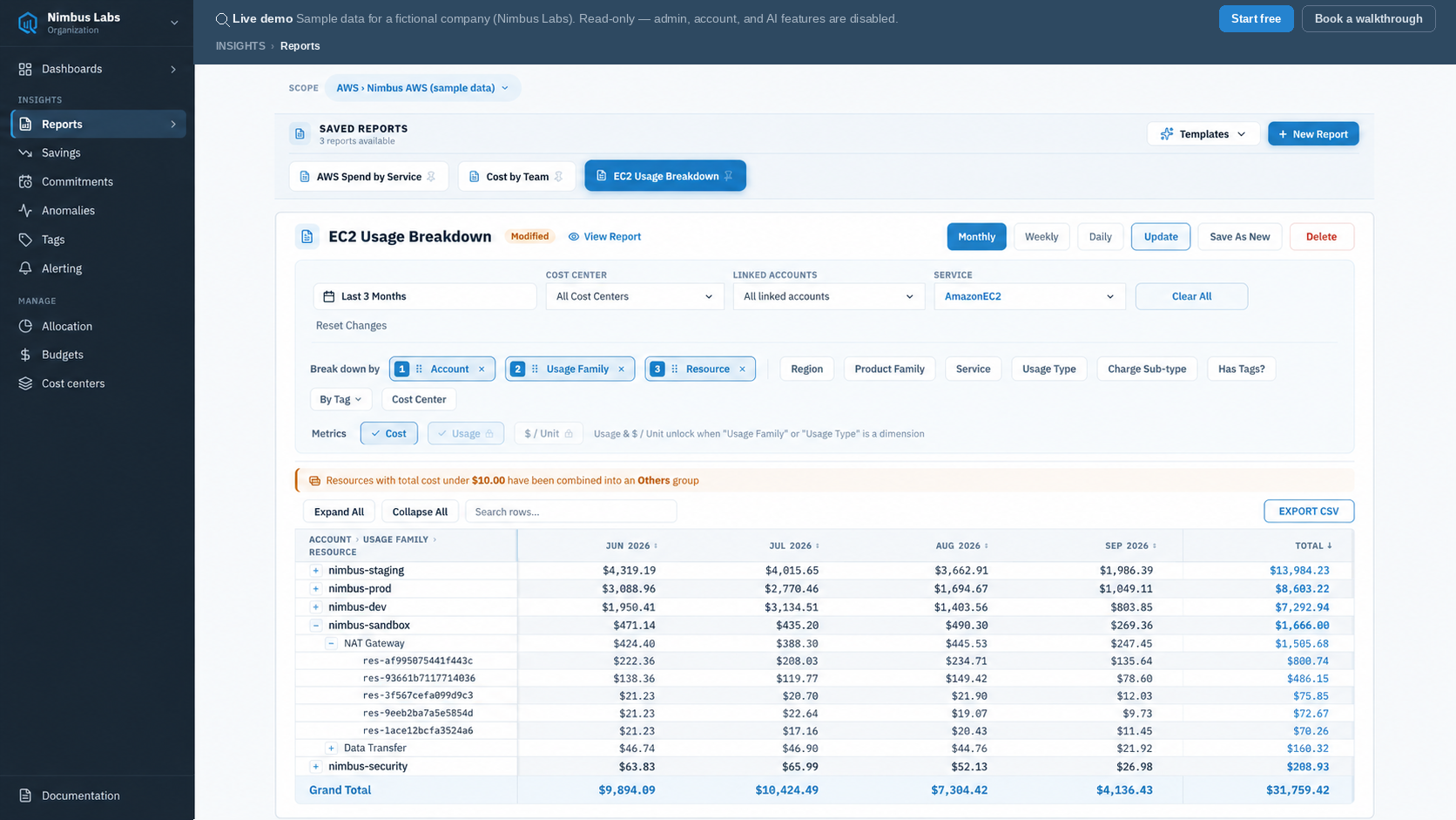
Reading the result is the investigation. The five accounts sort by spend. Expanding nimbus-sandbox shows which usage families make it up; expanding NAT Gateway inside it lists five resource IDs with their cost in each of the last three months and a row total. The answer to “which resource” is two clicks from the answer to “which account”, in the same table, with the totals still adding up to the same grand total.
The limits are worth knowing up front rather than discovering mid-investigation. Finer granularity buys a shorter window: monthly reports reach back six months, or three once Resource is one of the dimensions, while weekly covers eight weeks and daily covers 31 days. The table renders up to 5,000 rows and folds the long tail of low-cost resources into an Others row, with a banner naming the cutoff — the grand total still covers everything, trimmed rows included. Usage and $/Unit metrics unlock when Usage Family or Usage Type is in play and step aside when Resource is on, since one resource can bill in hours, gigabytes and requests at once.
What you keep is the configuration. A report that took a few minutes to build saves under a name and reruns next month, or goes out as a scheduled email, or exports to CSV with the same headers the table showed. Providers ship starting templates — EC2 Deep Dive and AWS by Account for AWS, Cost by Resource Group for Azure, Spend by Model for Anthropic and OpenAI, Warehouse Credit Trend for Snowflake.
Why grouping depth shows up in the finance work
The reason to care about ordered grouping is not ergonomics. Allocation rules, budgets and chargeback reports are all queries over the same dimensions, so whatever the reporting layer can express is the ceiling those processes inherit. When the answer routinely needs a third dimension, the gap gets filled by exported spreadsheets, and reconciliation errors move in with them.
Choosing a reporting workflow
On one cloud with a manageable number of accounts, the native tool is the right answer, and the first move is to turn on what you already have — enable resource-level granularity for your top services before concluding anything is missing from Cost Explorer.
A dedicated reporting layer earns its place when investigations routinely cross more than two dimensions, when the resource-level window is shorter than the question you are asking, or when the same question has to be asked of more than one provider in the same week. On CloudQuell that is AWS, Anthropic, OpenAI and Snowflake today, with Azure and Google Cloud in private beta and available on request.
Build the report above on live sample data — the demo is read-only and needs no account.
Open the live demo →How many dimensions can you group by in AWS Cost Explorer?
Up to two. The GetCostAndUsage API reference states that you can group costs “using up to two different groups, either dimensions, tag keys, cost categories, or any two group by types”. Investigating a third dimension means filtering to a value and running another report, or moving to the Cost and Usage Report.
Can AWS Cost Explorer show individual resource costs?
Yes, once resource-level data is enabled. The management account turns it on per service in Cost Management preferences, after which Group by: Resource works for those services and spend on the rest appears under “No resource ID”. It covers the past 14 days at daily granularity rather than full history, and Cost Explorer shows the top 5,000 most costly resources per service — AWS recommends the Cost and Usage Report for complete resource data.
Can Microsoft Cost Management track AWS spend?
No longer. Microsoft retired the Connector for AWS on 31 March 2025, ending access to AWS data in Cost Management and deleting the AWS cost data it had stored; the ability to add new connectors was disabled in March 2024. Microsoft recommends exporting in FOCUS format and analysing it in a separate reporting solution.
Does a FinOps platform combine AWS, Azure and Google Cloud in one report?
Not usually in a single table, and not in CloudQuell: a report reads one provider at a time, and resource-level grouping narrows to a single integration. What crosses providers is the layer above the report — a shared dimension vocabulary, so Usage Type means the same thing at every scope, and cost centers that allocate spend from any connected provider.
← Back to all posts